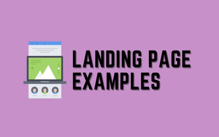
In the world of digital marketing, landing pages are a mechanic aiding in turning visitors into leads or customers. That is nearly the most important thing that web developers, as well as online marketers and digital marketers, will notice. In this blog post, we will visit the ten best landing page examples from 2024, hear their success factors, and provide workable solutions to create high-conversion landing pages.
What Is a Landing Page?
A landing page is a web-based site that is explicitly fashioned for a marketing or advertising campaign. This is the web page to which a visitor “lands” after pressing a link in a mail, ad, or any other digital location. You don’t have the luxury of stuffing a landing page with an array of different options; it needs to have one definite focus or an intention called a call-to-action (CTA). These direct goal landing pages lift your conversion rate, thereby making them very effective in increasing business sales.
What Makes a Landing Page Effective?
An effective landing page leads people towards definite actions, e.g., if they have to subscribe to a newsletter, or download a resource. Here are some elements that make it effective:
- Clear and Concise Titles: Approach the matter and articulate the value proposition in a very short time.
- Persuading the reader: Highlighting problems and suggesting solutions efficiently.
- Great Visuals: Stunning graphics or photos and other types that easily supplement the statement.
- Single CTA: There is only one call to action, which is fully visible and of a different color, gesture, or mode.
- Social Proof: First-hand accounts, product reviews, and client statuses are the ones that establish brand credibility, turning trust issues into sell-outs.
- Mobile optimization: Ensure that the landing page meets the users’ requirements by properly adjusting it and making it functional on any device.
- Fast Load Time: Quick loading time to keep the visitors’ interest in the webpage.
10 Best Landing Page Examples for 2024
Dropbox Business
Key Takeaway:
Intuitive Design and Clear CTA Buttons for Easy User Navigation
Dropbox Business, the first thing that was passed on to newcomers, is a minimalist and functional website. The page is cleverly designed with empty spaces, which directs the focus to the main themes of the page, maximizing its one-word capacity. A direct text consisting of the business proposition and the prominent CTA buttons is there to push users to check in or read on.
Why it Works:
- User-Friendly Navigation: Elements are positioned in a way that the user feels they are progressing through the page logically.
- Clear CTAs: “Get Started” and “Learn More” buttons are displayed prominently, sparing any confusion and propelling the user to take action.
- Visual Appeal: The artistic impression is also strong, and good visuals, like the ones seen on the clean layout, enhance the overall user perception.
Hosting Airbnb
Key Takeaway:
Personalized Content and User Experience that Builds Trust and Encourages Sign-Ups
Airbnb Hosts’ landing page uses personalized content to establish a link to its target audience. The website contains true photographs of the hosts and their properties, thus creating genuine trust. The text is fun and direct to the point and speaks to potential hosts by addressing their boats and the benefits of joining Airbnb.
Why it Works:
- Personalization: The site’s use of real images and authentic reviews forms real connections with potential visitors.
- Engaging Copy: The relatable text is rooted in the issues and dreams of the potential hosts.
- Trust-Building Elements: In addition to providing details about the digital tour and host experiences, proof of humanity through metamaterials gives the platform warm and inviting feelings.
Slack
Key Takeaway:
Simple Design but Catches and Shows Product Features Efficiently
The Slack landing page is a very good instrument that teaches us plenty about minimalism’s strengths. The page is built on an uncomplicated design that lets the product features do the talking. The hallmark of this layout is that it is user-friendly and uncluttered; rather, it keeps only necessary elements and leaves the rest white. The design efficiently employs pictures and brief texts to communicate Slack’s core functions, which allows visitors to understand the product’s value quickly.
Why it Works:
- Minimalistic Design: A crisper and clearer layout without any distracting elements visible contributes to better customer understanding and feeling of the product’s benefits.
- Effective Use of Visuals: The shots and images are the showpieces that are made visually interactive to explain what Slack is all about. This, in turn, without running ineffectively without words, also achieves clarity and hence makes the tutorial more effective.
- Concise Copy: The copy focuses on only the most important factors that the readers need to know, using short but powerful sentences.
HubSpot CRM
Key Takeaway:
Compelling Visuals and Concise Copy to Communicate the Value Proposition
HubSpot CRM’s landing page blends convincing visuals with a brief copy in a way that leaves them in no doubt about what the product is and how it stands out among its kind, not least through its look, which is modern and trendy. This site displays quite several different photos and images of very high standards and plenty of diagrams, which non-verbally tell you about their key points and advantages. The slogan concentrates on how HubSpot CRM can solve users’ problems, which is clear, making it a truly solution-oriented web section that allows users to understand the value proposition.
Why it Works:
- Visual Communication: Different kinds of Visuals, such as images and infographics, clarify what the page is all about, thus facilitating the process of understanding.
- Conciseness: The copy is plain and mentions the most vital benefits of using HubSpot CRM.
- Powerful CTAs: The site stands out with call-to-action buttons. These buttons ask visitors to complete the required task, leading to a higher conversion path.
Shopify
Key Takeaway:
Optimum exquisiteness of Virtue Images via CTA Buttons for Immediate Sales
Shopify produces a dream landing page, all that is fun and games with the soul of your other content. The website is an image-heavy shopfront for products and stores built on Shopify that entices and seduces. Some of the calls-to-action are placed alongside these visuals, thus simplifying the task necessary to get the visitors.
Why it Works:
- Aspirational Imagery: Engaging, well-done photos of excursions motivate and guide the users through the app Shopify.
- Strategic CTAs: More specifically, buttons like “Start Free Trial” are in the environs near the corresponding images; thus, visitors feel the immediate necessity of taking action.
- Clear Value Proposition: The text clearly shows the platform’s ease of use and advantages, thus inducing visitors to subscribe.
Unbounce
Key Takeaway:
Usage of Landing Page best practices such as A/B Testing and Mobile Responsiveness
Unbounce’s landing page is a good example of best practices for landing page use. Designed for computers and mobile phones, the web page performs well regardless of platform. Unbounce also underlines the significance of A/B testing, exhibiting its skills in making impactful landing pages.
Why it Works:
- Mobile Optimization: The page is completely responsive, which allows a great user experience on every device.
- A/B Testing: This feature demonstrates Unbounce’s effort to make more customers click on the advertisements.
- Knowledge and Authority: The material supports the company’s position in landing page optimization management.
Trello
Key Takeaway:
Use of Interactive Elements and Social Proof for User Engagement
Trello’s landing page includes a variety of ways for visitors to interact and become more aware of social proof. The webpage, for example, allows customers to ‘test-drive’ product features, which allows them to become familiar with Trello’s intended uses through experimentation.
Why it Works:
- Interactive Demos: A successful method of pitching Trello to visitors is to allow them to get their hands on it and test its utility and benefits.
- Social Proof: Providing real user testimonials and practice cases can help make the service more sought after.
- Engaging Design: The interactive elements are not only aesthetically pleasing but also keep visitors engaged, therefore increasing the chances of them turning into customers.
Squarespace
Key Takeaway:
Visual Storytelling and User-Focused Design that Drives Conversions
The website landing page of Squarespace uses visual storytelling to attract visitors and ensure more conversions. The website, which is a showcase of incredibly beautiful and dynamic sites designed with Squarespace, also provides’ A journey through the medium of visual arts that instantly mint visitors. The end user-focused design, on the other hand, makes sure that all necessary information is at hand and that it is easy to find, thus leading the visitors to sign up.
Why it Works:
- Visual Storytelling: This pretty and engaging infographic is a good example of something made with Squarespace.
- User-Focused Design: The page’s format is clear, allowing users to find what they are looking for easily and register through the website.
- Inspiring Content: The images and texts result in visitors being compelled to do the same, which is to make them create their breathtaking website.
ConvertKit
Key Takeaway:
Targeted Content and Clear CTA to Grow Email List
The main features of ConvertKit’s landing page are targeted content and clear CTAs to grow its email list. The page aims to ensure it meets the creators’ requirements. It features not only some of the well-sought resources and insights but is also created with the creators in mind. Such CTAs prove to be convincing and powerful, bracing the attendees to show their email and thus turn out as part of the ConvertKit Community.
Why it Works:
- Targeted Content: The page is created using a personalized approach, which means it talks back to creators and meets their requirements and challenges.
- Clear CTAs: Situated at the top of the page, you can easily find the “Join Now” and “Get Started” buttons on demand, and these are the main tools of persuasive text.
- Valuable Resources: This content has real quality, causing visitors to leave their addresses to get it.
Zendesk
Key Takeaway:
Persuasive Copy and Social Proof to Convert
Zendesk’s landing page demonstrated persuasive copy and social proof by converting visitors into customers. This page displays catchy headlines and direct beneficiary-oriented copy that describes Zendesk’s benefits. The personal opinions and logos of the clients are the social proof that the brand succeeds in establishing trust and credibility.
Why it Works
- The Persuasive Copy: The text concentrates on the benefits of helping visitors understand why they should prefer Zendesk.
- Social Proof: The presence of testimonials and logos of the client companies not only generates trust but also makes the product more enticing for potential clients.
- Clear Value Proposition: The copy is highly convincing in describing the benefits of using Zendesk, leading to conversions.
What Are the Prime Lessons from Landing Page Examples?
- Simplicity is a force to be reckoned with. Designs that have a bare minimum of elements and readable text will guarantee that your visitors understand and take action.
- Strong CTAs make a difference. Try to make your CTA more visible and visually attractive so that visitors will click on it.
- Visuals and the creative stuff are the most engaging parts. Impressive images and videos will greatly heighten the user experience.
- Social proof creates confidence. Use testimonials and case studies to prove that your website is believable.
- Benefits are the main thing, not the features. Be very clear about how using the product or service will improve the prospect of vibes or terms of a product.
Elements of a High-Converting Landing Page
Clear Headline
The headline has to be very powerful because it can not convey the main guarantee of your tender in the first view of your visitor. It should also be appealing and useful for the guests.
Compelling Copy
The body copy will persuade and stress your proposal’s selling points. Use bullet points to aid the reader in understanding what you are discussing.
High-Quality Visuals
The visuals and video should support your message and show the unique advantages of your offer. They should also be clear and fit your content perfectly.
Strong CTA
Your CTA must be visible on the page and must contain the command indicating what the visitor should do. Use contrasting colors and language that elicit action.
Social Proof
Build trust with your visitors by incorporating testaments, reviews, or case studies. Actual experiences of customers can greatly reinforce your trustworthiness.
Minimal Distractions
A landing page should have a single focus. Get rid of extra components that might lead the visitor’s attention away from the CTA.
Tips for Constructing Landing Pages That Shine
Here are some expert tips to make your landing pages stand out:
- A/B Testing: This is testing to see which works best between two different web pages to find the winner. This cannot just ask you to optimize your design and your messaging by using the reports over time.
- Mobile Optimization: Your landing page should be easy to use on any device. Many of your visits will probably come from users of mobile devices.
- Fast Loading Times: A sluggish loading page may turn visitors away. Optimize your images and reduce the number of scripts to improve the loading/processing time accordingly.
- Consistent Branding: Your brand’s look should be visible on your landing page. A unified outlook on your brand will make building trust and recognition easier.
Wrapping Up
Efficient landing page development ensures engagement, leading to the attainment of marketing objectives. By analyzing the best landing page samples of 2024 and implementing key elements and strategies, you can build landing pages that will compete with the best and guarantee results.
A big part of your success lies in understanding your audience, giving them different and interesting reasons, and always testing and improving your site. Combining these guidelines and practices, pathfinding to the high-lead landing pages that can help you achieve the best digital marketing is getting smoother.
Cheerful landing page building!